eCommerce / UI / UX / WordPress /
Digital aesthetic that matches an unrivaled in-store experience
For over 25 years, Shack has been a leader in homewares, furniture, and home decor, and have earned an enviable reputation for sourcing items of beauty from across the globe.
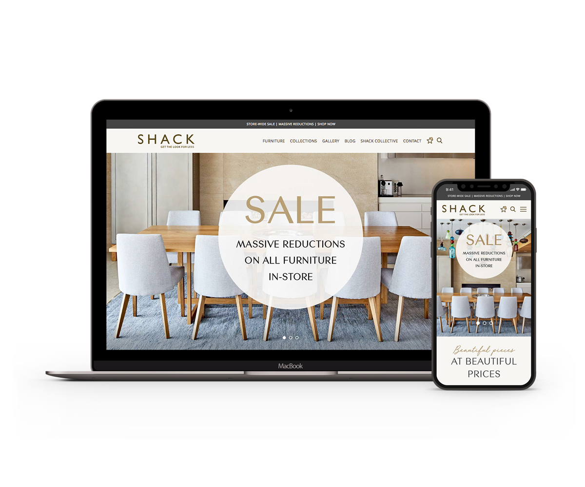
Searching for opportunities to create better customer engagement, they turned to us to redefine the Shack brand and image. They wanted to appeal to a broader audience, particularly in the digital space creating an aesthetic that matched an unrivaled in-store experience.
Brand Strategy
In collaboration with Shack, the aim was to create a unique style that would help the brand stand out in a highly competitive retail market.
With this in mind, we produced a comprehensive style guide. This document was used to define typeface sets and arrangements, colour options, product photography, compositions, icon sets, buttons and form elements.
User Interface
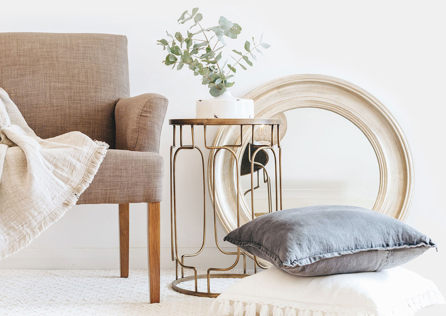
The primary objective of the website redesign was to create a product-focused platform. We set out to achieve this by reducing background noise and delivering a structured layout.
With a collection of high-quality photos to work with, we opted to flood the home screen with image-based content. In some instances, images were accompanied by a solid block offset colour – a detail that resembled a collage.

User Experience
Traditional eCommerce websites incorporate shopping carts and checkouts to facilitate online purchasing. For this particular client, however, they didn’t want that. Their aim was to increase exposure and convert the online audience into in-store foot traffic.
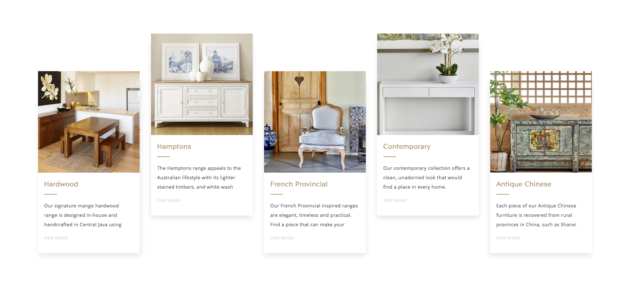
To provide a positive user experience we wanted to reduce clicks and make it easy for visitors to discover products on both desktop and mobile. To facilitate this we implemented a flat sitemap structure placing furniture in categories, collections, and ranges.
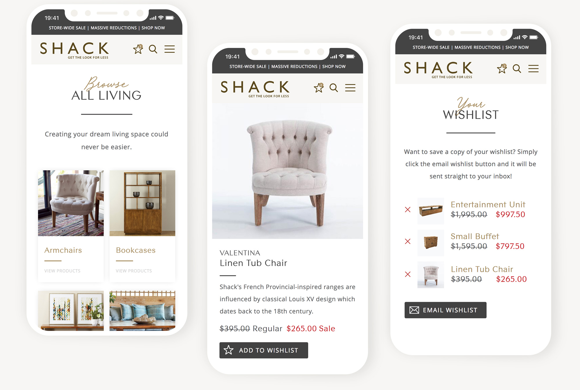
Ensuring that the online experience was an interactive one we incorporated a wishlist. Unlike typical wishlists where you need to create an account, the wishlist on the Shack website is simple. Once products have been added to your list you can quickly and very easily email it to yourself.
The Outcome
The new Shack website offers visitors a first-class experience of modern design. Using a combination of beautiful type, soft neutral colours and warm gold accents we were successfully able to recreate the in-store ambiance in the digital space.

Lance and Julia Shofer, Shack Homewares “We love our new website and how it has all come together. As always it is an absolute pleasure working with you.”

