UI / UX / WordPress /
Enhanced usability for enhanced media metrics Australia
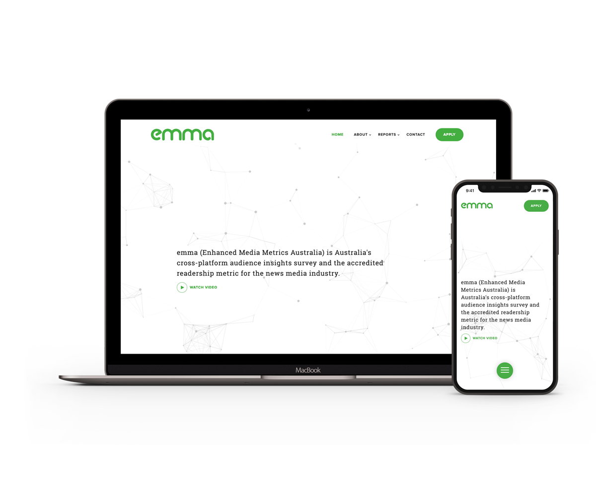
emma (Enhanced Media Metrics Australia) is Australia’s most accurate readership survey conducted by Ipsos and fused by Nielsen.
These surveys are carried out every month detailing audience metrics for cross-media platforms. Data is provided for over 600 publications (digital and print) making it the most comprehensive insights survey for the news media industry.
The Objective
Late in 2017 we were contacted and asked to help re-energise the emma website. The previous website lacked flow and direction. The audience reports were frustrating to navigate as they each loaded onto a separate page. The section to ‘apply for readership’ was difficult to locate not to mention that the form itself was rather lifeless. In turn, all these issues made for a very underwhelming user experience.

Clarity, Usability, and Management
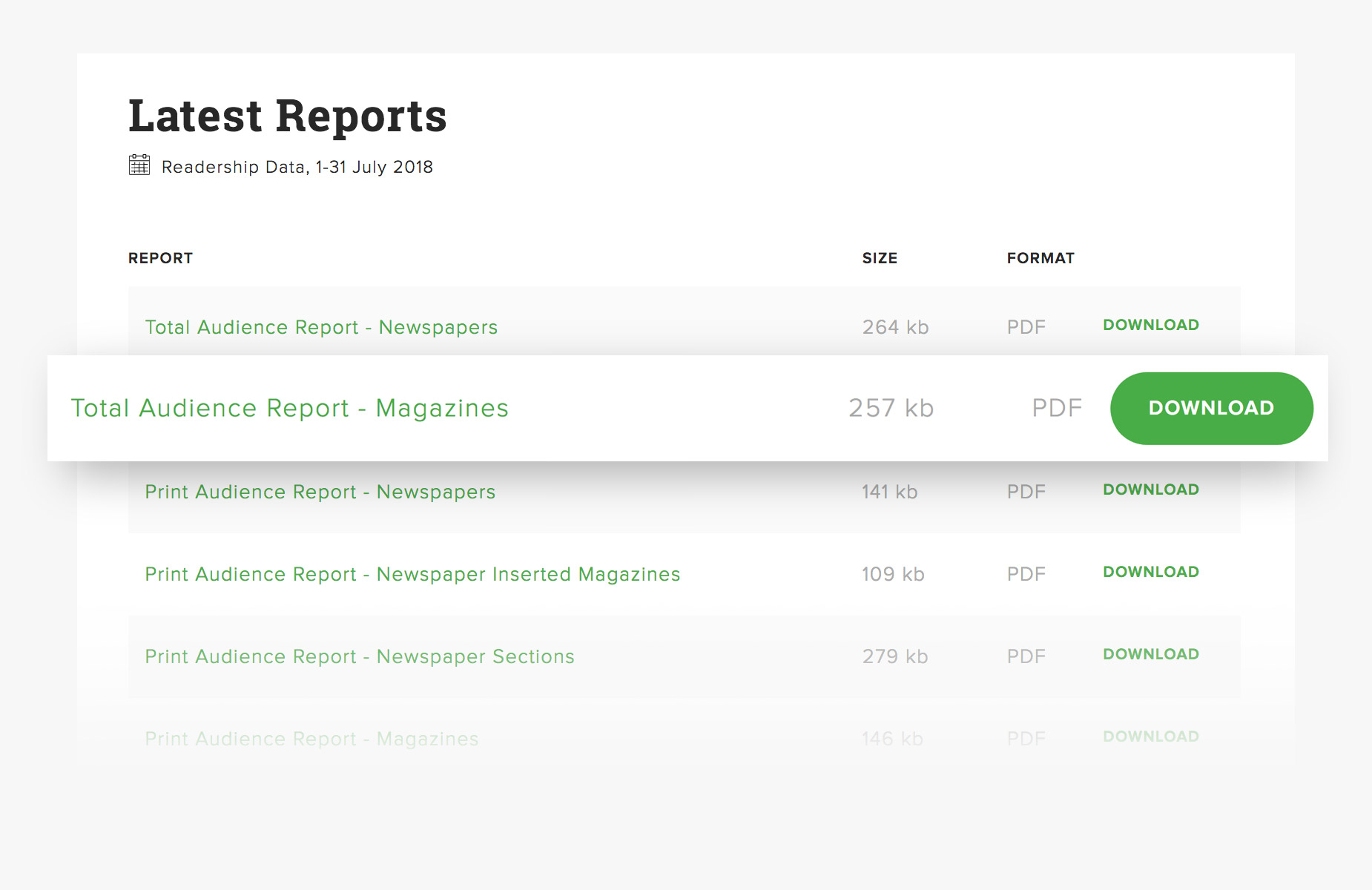
We set out to make it as easy as possible for visitors to quickly view and download audience reports. Hence the new emma website houses all monthly data sets on a single page dating back to 2013. We didn’t stop there either. Under the hood, we also made a point of making it easy for our client to manage, maintain and publish content.


A premium experience, all round.
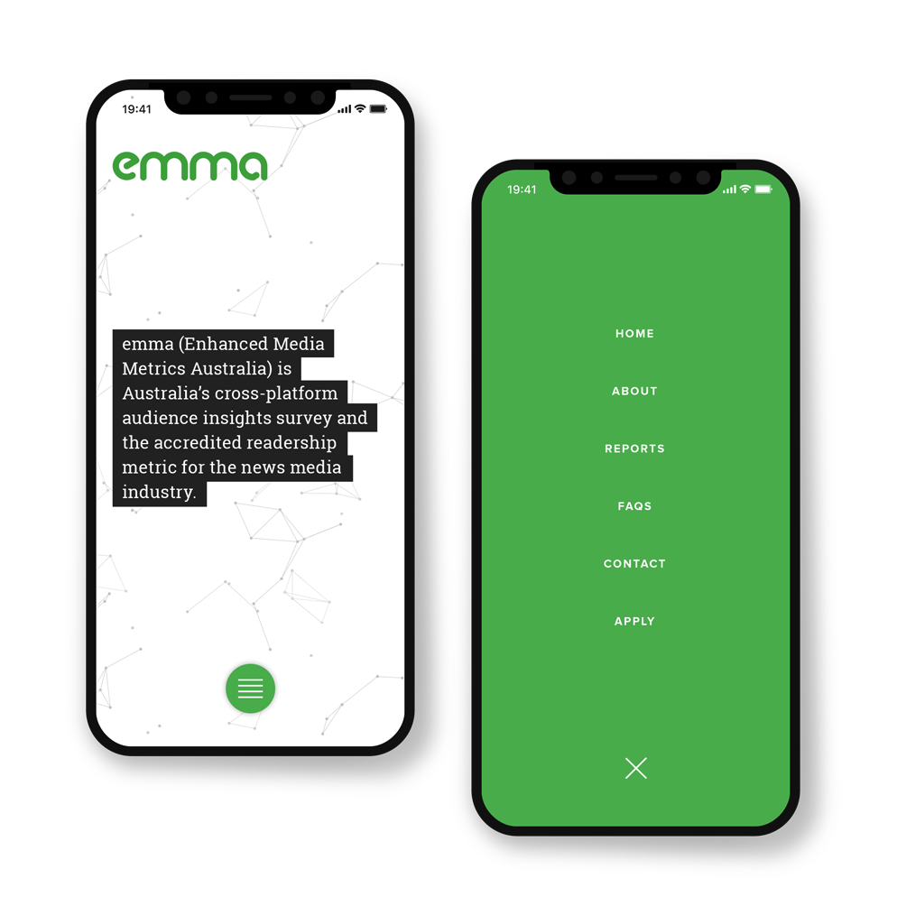
From desktop through to mobile, every facet of this digital platform has been designed with a focus on user experience. Subtle animations and clear call to actions entice visitor engagement.
Powered by WordPress this purpose-built site offers an immeasurable capacity for growth and expansion.

Charlie Murdoch, NewsMediaWorks “Looks grand! We are already noticing much better brand engagement. An absolute pleasure doing work with you”

